

実行中の時計を実装するための純粋な CSS3 コード
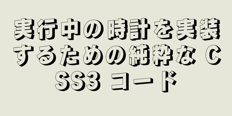
操作効果
コードの実装html
<div id="ウォッチ">
  <div class="frame-face"></div>
  <ul class="分マーク">
    <li></li><li></li><li></li><li></li><li></li><li></li><li></li>
    <li></li><li></li><li></li><li></li><li></li><li></li><li></li>
    <li></li><li></li><li></li><li></li><li></li><li></li><li></li>
    <li></li><li></li><li></li><li></li><li></li><li></li><li></li>
    <li></li><li></li><li></li><li></li><li></li><li></li><li></li>
    <li></li><li></li><li></li><li></li><li></li><li></li><li></li>
    <li></li><li></li><li></li><li></li><li></li><li></li><li></li>
    <li></li><li></li><li></li><li></li><li></li><li></li><li></li>
  </ul>
  <div class="デジタルラップ">
    <ul class="digit-hours">
      <li>23</li>
      <li>00</li><li>01</li><li>02</li><li>03</li><li>04</li><li>05</li>
      <li>06</li><li>07</li><li>08</li><li>09</li><li>10</li><li>11</li>
      <li>12</li><li>13</li><li>14</li><li>15</li><li>16</li><li>17</li>
      <li>18</li><li>19</li><li>20</li><li>21</li><li>22</li>
    </ul>
    <ul class="digit-minutes">
      <li>10</li><li>11</li>
      <li>12</li><li>13</li><li>14</li><li>15</li><li>16</li><li>17</li>
      <li>18</li><li>19</li><li>20</li><li>21</li><li>22</li><li>23</li>
      <li>24</li><li>25</li><li>26</li><li>27</li><li>28</li><li>29</li>
      <li>30</li><li>31</li><li>32</li><li>33</li><li>34</li><li>35</li>
      <li>36</li><li>37</li><li>38</li><li>39</li><li>40</li><li>41</li>
      <li>42</li><li>43</li><li>44</li><li>45</li><li>46</li><li>47</li>
      <li>48</li><li>49</li><li>50</li><li>51</li><li>52</li><li>53</li>
      <li>54</li><li>55</li><li>56</li><li>57</li><li>58</li><li>59</li>
      <li>00</li><li>01</li><li>02</li><li>03</li><li>04</li><li>05</li>
      <li>06</li><li>07</li><li>08</li><li>09</li>
    </ul>
    <ul class="digit-seconds">
      <li>20</li><li>21</li><li>22</li><li>23</li>
      <li>24</li><li>25</li><li>26</li><li>27</li><li>28</li><li>29</li>
      <li>30</li><li>31</li><li>32</li><li>33</li><li>34</li><li>35</li>
      <li>36</li><li>37</li><li>38</li><li>39</li><li>40</li><li>41</li>
      <li>42</li><li>43</li><li>44</li><li>45</li><li>46</li><li>47</li>
      <li>48</li><li>49</li><li>50</li><li>51</li><li>52</li><li>53</li>
      <li>54</li><li>55</li><li>56</li><li>57</li><li>58</li><li>59</li>
      <li>00</li><li>01</li><li>02</li><li>03</li><li>04</li><li>05</li>
      <li>06</li><li>07</li><li>08</li><li>09</li><li>10</li><li>11</li>
      <li>12</li><li>13</li><li>14</li><li>15</li><li>16</li><li>17</li>
      <li>18</li><li>19</li>
    </ul>
  </div>
  <ul class="数字">
    <li>1</li><li>2</li><li>3</li><li>4</li><li>5</li><li>6</li>
    <li>7</li><li>8</li><li>9</li><li>10</li><li>11</li><li>12</li>
  </ul>
  <div class="時針"></div>
  <div class="分針"></div>
  <div class="seconds-hand"></div>
</div>
CSS3
本文 { フォントサイズ:62.5%; 余白:1em; 背景:#232425 }
ul { リストスタイル:なし; マージン:0; パディング:0 }
#watch { フォントサイズ:1em; 位置:相対 }
#watch .frame-face {
  位置:相対;
  幅:30em;
  高さ:30em;
  マージン:2em 自動;
  境界線の半径:15em;
  背景:-webkit-linear-gradient(上、#f9f9f9、#666);
  背景:-moz-linear-gradient(上、#f9f9f9、#666);
  背景: linear-gradient(下へ、#f9f9f9、#666);
  ボックスシャドウ:rgba(0,0,0,.8) .5em .5em 4em;
}
#watch .frame-face:before {
  コンテンツ:'';
  幅:29.4em;
  高さ:29.4em;
  境界線の半径:14.7em;
  位置:絶対;
  上:.3em; 左:.3em;
  背景:
    -webkit-linear-gradient(135度、rgba(246,248,249,0) 0%、rgba(229,235,238,1) 50%、rgba(205,212,217,1) 51%、rgba(245,247,249,0) 100%)、
    -webkit-radial-gradient(center、楕円カバー、rgba(246,248,249,1) 0%、rgba(229,235,238,1) 65%、rgba(205,212,217,1) 66%、rgba(245,247,249,1) 100%);
  背景:
    -moz-線形グラデーション(135度、rgba(246,248,249,0) 0%、rgba(229,235,238,1) 50%、rgba(205,212,217,1) 51%、rgba(245,247,249,0) 100%)、
    -moz-radial-gradient(center、楕円カバー、rgba(246,248,249,1) 0%、rgba(229,235,238,1) 65%、rgba(205,212,217,1) 66%、rgba(245,247,249,1) 100%);
  背景:
    線形グラデーション(135度、rgba(246,248,249,0) 0%、rgba(229,235,238,1) 50%、rgba(205,212,217,1) 51%、rgba(245,247,249,0) 100%)、
    放射状グラデーション(中心に楕円、rgba(246,248,249,1) 0%、rgba(229,235,238,1) 65%、rgba(205,212,217,1) 66%、rgba(245,247,249,1) 100%);
}
#watch .frame-face:after {
  コンテンツ:'';
  幅:28em;
  高さ:28em;
  境界線の半径:14.2em;
  位置:絶対;
  上:.9em; 左:.9em;
  ボックスシャドウのインセット rgba(0,0,0,.2) .2em .2em 1em;
  境界線:.1em実線rgba(0,0,0,.2);
  背景:-webkit-linear-gradient(上、#fff、#ccc);
  背景:-moz-linear-gradient(上、#fff、#ccc);
  背景: linear-gradient(下へ、#fff、#ccc);
}
#watch .分マーク li {
  表示:ブロック;
  幅:.2em;
  高さ:.6em;
  背景:#929394;
  位置:絶対;
  上:50%; 左:50%;
  マージン:-.4em 0 0 -.1em;
}
#watch .minute-marks li:first-child {transform:rotate(6deg) translateY(-12.7em)}
#watch .minute-marks li:nth-child(2) {transform:rotate(12deg) translateY(-12.7em)}
#watch .minute-marks li:nth-child(3) {transform:rotate(18deg) translateY(-12.7em)}
#watch .minute-marks li:nth-child(4) {transform:rotate(24deg) translateY(-12.7em)}
#watch .minute-marks li:nth-child(5) {transform:rotate(36deg) translateY(-12.7em)}
#watch .minute-marks li:nth-child(6) {transform:rotate(42deg) translateY(-12.7em)}
#watch .minute-marks li:nth-child(7) {transform:rotate(48deg) translateY(-12.7em)}
#watch .minute-marks li:nth-child(8) {transform:rotate(54deg) translateY(-12.7em)}
#watch .minute-marks li:nth-child(9) {transform:rotate(66deg) translateY(-12.7em)}
#watch .minute-marks li:nth-child(10) {transform:rotate(72deg) translateY(-12.7em)}
#watch .minute-marks li:nth-child(11) {transform:rotate(78deg) translateY(-12.7em)}
#watch .minute-marks li:nth-child(12) {transform:rotate(84deg) translateY(-12.7em)}
#watch .minute-marks li:nth-child(13) {transform:rotate(96deg) translateY(-12.7em)}
#watch .minute-marks li:nth-child(14) {transform:rotate(102deg) translateY(-12.7em)}
#watch .minute-marks li:nth-child(15) {transform:rotate(108deg) translateY(-12.7em)}
#watch .minute-marks li:nth-child(16) {transform:rotate(114deg) translateY(-12.7em)}
#watch .minute-marks li:nth-child(17) {transform:rotate(126deg) translateY(-12.7em)}
#watch .minute-marks li:nth-child(18) {transform:rotate(132deg) translateY(-12.7em)}
#watch .minute-marks li:nth-child(19) {transform:rotate(138deg) translateY(-12.7em)}
#watch .minute-marks li:nth-child(20) {transform:rotate(144deg) translateY(-12.7em)}
#watch .minute-marks li:nth-child(21) {transform:rotate(156deg) translateY(-12.7em)}
#watch .minute-marks li:nth-child(22) {transform:rotate(162deg) translateY(-12.7em)}
#watch .minute-marks li:nth-child(23) {transform:rotate(168deg) translateY(-12.7em)}
#watch .minute-marks li:nth-child(24) {transform:rotate(174deg) translateY(-12.7em)}
#watch .minute-marks li:nth-child(25) {transform:rotate(186deg) translateY(-12.7em)}
#watch .minute-marks li:nth-child(26) {transform:rotate(192deg) translateY(-12.7em)}
#watch .minute-marks li:nth-child(27) {transform:rotate(198deg) translateY(-12.7em)}
#watch .minute-marks li:nth-child(28) {transform:rotate(204deg) translateY(-12.7em)}
#watch .minute-marks li:nth-child(29) {transform:rotate(216deg) translateY(-12.7em)}
#watch .minute-marks li:nth-child(30) {transform:rotate(222deg) translateY(-12.7em)}
#watch .minute-marks li:nth-child(31) {transform:rotate(228deg) translateY(-12.7em)}
#watch .minute-marks li:nth-child(32) {transform:rotate(234deg) translateY(-12.7em)}
#watch .minute-marks li:nth-child(33) {transform:rotate(246deg) translateY(-12.7em)}
#watch .minute-marks li:nth-child(34) {transform:rotate(252deg) translateY(-12.7em)}
#watch .minute-marks li:nth-child(35) {transform:rotate(258deg) translateY(-12.7em)}
#watch .minute-marks li:nth-child(36) {transform:rotate(264deg) translateY(-12.7em)}
#watch .minute-marks li:nth-child(37) {transform:rotate(276deg) translateY(-12.7em)}
#watch .minute-marks li:nth-child(38) {transform:rotate(282deg) translateY(-12.7em)}
#watch .minute-marks li:nth-child(39) {transform:rotate(288deg) translateY(-12.7em)}
#watch .minute-marks li:nth-child(40) {transform:rotate(294deg) translateY(-12.7em)}
#watch .minute-marks li:nth-child(41) {transform:rotate(306deg) translateY(-12.7em)}
#watch .minute-marks li:nth-child(42) {transform:rotate(312deg) translateY(-12.7em)}
#watch .minute-marks li:nth-child(43) {transform:rotate(318deg) translateY(-12.7em)}
#watch .minute-marks li:nth-child(44) {transform:rotate(324deg) translateY(-12.7em)}
#watch .minute-marks li:nth-child(45) {transform:rotate(336deg) translateY(-12.7em)}
#watch .minute-marks li:nth-child(46) {transform:rotate(342deg) translateY(-12.7em)}
#watch .minute-marks li:nth-child(47) {transform:rotate(348deg) translateY(-12.7em)}
#watch .minute-marks li:nth-child(48) {transform:rotate(354deg) translateY(-12.7em)}
#watch .数字{
  幅:30em;
  高さ:30em;
  境界線の半径:15em;
  位置:絶対;
  上:0; 左:50%;
  左マージン:-15em;
}
#watch .digits li {
  フォントサイズ:1.6em;
  表示:ブロック;
  幅:1.6em;
  高さ:1.6em;
  位置:絶対;
  上:50%; 左:50%;
  行の高さ:1.6em;
  テキスト配置:中央;
  マージン:-.8em 0 0 -.8em;
  フォントの太さ:太字;
}
#watch .digits li:nth-child(1) { transform:translate(3.9em, -6.9em) }
#watch .digits li:nth-child(2) { transform:translate(6.9em, -4em) }
#watch .digits li:nth-child(3) { transform:translate(8em, 0) }
#watch .digits li:nth-child(4) { transform:translate(6.8em, 4em) }
#watch .digits li:nth-child(5) { transform:translate(3.9em, 6.9em) }
#watch .digits li:nth-child(6) { transform:translate(0, 8em) }
#watch .digits li:nth-child(7) { transform:translate(-3.9em, 6.9em) }
#watch .digits li:nth-child(8) { transform:translate(-6.8em, 4em) }
#watch .digits li:nth-child(9) { transform:translate(-8em, 0) }
#watch .digits li:nth-child(10) { transform:translate(-6.9em, -4em) }
#watch .digits li:nth-child(11) { transform:translate(-3.9em, -6.9em) }
#watch .digits li:nth-child(12) { transform:translate(0, -8em) }
#watch .digits:before {
  コンテンツ:'';
  幅:1.6em;
  高さ:1.6em;
  境界線の半径:.8em;
  位置:絶対;
  上:50%; 左:50%;
  マージン:-.8em 0 0 -.8em;
  背景:#121314;
}
#watch .digits:after {
  コンテンツ:'';
  幅:4em;
  高さ:4em;
  境界線の半径:2.2em;
  位置:絶対;
  上:50%; 左:50%;
  マージン:-2.1em 0 0 -2.1em;
  境界線:.1em 実線 #c6c6c6;
  背景:-webkit-radial-gradient(center、楕円カバー、rgba(200,200,200,0)、rgba(190,190,190,1) 90%、rgba(130,130,130,1) 100%);
  背景:-moz-radial-gradient(center、楕円カバー、rgba(200,200,200,0)、rgba(190,190,190,1) 90%、rgba(130,130,130,1) 100%);
  背景:放射状グラデーション(中心に楕円、rgba(200,200,200,0)、rgba(190,190,190,1) 90%、rgba(130,130,130,1) 100%);
}
@keyframes hours { から {transform:rotate(335deg)} }
#watch .hours-hand {
  幅:.8em;
  高さ:7em;
  境界線の半径:0 0 .9em .9em;
  背景:#232425;
  位置:絶対;
  下:50%; 左:50%;
  マージン:0 0 -.8em -.4em;
  ボックスシャドウ:#232425 0 0 2px;
  変換の原点:0.4em 6.2em;
  変換:回転(-25度);
  アニメーション:時間 43200秒 線形 0秒 無限;
}
#watch .hours-hand:before {
  コンテンツ:'';
  背景:継承;
  幅:1.8em;
  高さ:.8em;
  境界線の半径:0 0 .8em .8em;
  ボックスシャドウ:#232425 0 0 1px;
  位置:絶対;
  上:-.7em; 左:-.5em;
}
#watch .hours-hand:after {
  コンテンツ:'';
  幅:0; 高さ:0;
  境界線:.9em 実線 #232425;
  境界線の幅:0.9em 2.4em .9em;
  左境界線の色:透明;
  右境界線の色:透明;
  位置:絶対;
  上:-3.1em; 左:-.5em;
}
@keyframes 分 { から {transform:rotate(422deg)} }
#watch .分針 {
  幅:.8em;
  高さ:12.5em;
  境界線の半径:.5em;
  背景:#343536;
  位置:絶対;
  下:50%; 左:50%;
  マージン:0 0 -1.5em -.4em;
  ボックスシャドウ:#343536 0 0 2px;
  変換の原点:0.4em 11em;
  変換:回転(62度);
  アニメーション:分 3600秒 線形 0秒 無限;
}
@keyframes 秒 { から {transform:rotate(480deg)} }
#watch .秒針 {
  幅:.2em;
  高さ:14em;
  境界線の半径:.1em .1em 0 0/10em 10em 0 0;
  背景:#c00;
  位置:絶対;
  下:50%; 左:50%;
  マージン:0 0 -2em -.1em;
  ボックスシャドウ:rgba(0,0,0,.8) 0 0 .2em;
  変換の原点:0.1em 12em;
  変換:回転(120度);
  アニメーション:秒 60秒 ステップ(60, 終了) 0秒 無限;
}
#watch .seconds-hand:after {
  コンテンツ:'';
  幅:1.4em;
  高さ:1.4em;
  境界線の半径:.7em;
  背景:継承;
  位置:絶対;
  左:-.65em; 下:1.35em;
}
#watch .seconds-hand:before {
  コンテンツ:'';
  幅:.8em;
  高さ:3em;
  境界線の半径:.2em .2em .4em .4em/.2em .2em 2em 2em;
  ボックスシャドウ:rgba(0,0,0,.8) 0 0 .2em;
  背景:継承;
  位置:絶対;
  左:-.35em; 下:-3em;
}
#watch .デジタルラップ{
  幅:9em;
  高さ:3em;
  境界線:.1em 実線 #222;
  境界線の半径:.2em;
  位置:絶対;
  上:50%; 左:50%;
  マージン:3em 0 0 -4.5em;
  オーバーフロー:非表示;
  背景:#4c4c4c;
  背景:-webkit-linear-gradient(上、#4c4c4c 0%、#0f0f0f 100%);
  背景:-moz-linear-gradient(上、#4c4c4c 0%、#0f0f0f 100%);
  背景:-ms-linear-gradient(上、#4c4c4c 0%、#0f0f0f 100%);
  背景:-o-linear-gradient(上、#4c4c4c 0%、#0f0f0f 100%);
  背景:線形グラデーション(下へ、#4c4c4c 0%、#0f0f0f 100%);
}
#watch .digital-wrap ul {
  フロート:左;
  幅:2.85em;
  高さ:3em;
  右ボーダー:.1em 実線 #000;
  色:#ddd;
  フォントファミリー:Consolas、モナコ、等幅;
}
#watch .digital-wrap ul:last-child { border:none }
#watch .digital-wrap li {
  フォントサイズ:1.5em;
  行の高さ:2;
  文字間隔:2px;
  テキスト配置:中央;
  位置:相対;
  左:1px;
}
#watch .digit-minutes li {
  アニメーション:dsm 3600秒ステップ(60、終了) 0秒無限;
}
#watch .digit-seconds li {
  アニメーション:dsm 60秒ステップ(60、終了) 0秒無限;
}
@キーフレームdsm {
  { transform:translateY(-120em) } に変更
}
上記は純粋な CSS3 で実装された時計の詳細です。CSS3 時計の詳細については、123WORDPRESS.COM の他の関連記事に注目してください。 |
>>: Hyper-v仮想マシンを使用してCentos7をインストールする


推薦する
IE6 フォントを定義できません: 13px サイズは無効です。IE6 は自動的に大きいフォント ソリューションを表示します。
数日前、Web ページのモジュールを調整していたとき、ページのフォント サイズを 13px に設定し...
MySQLでテーブル名を変更する方法と注意すべき点
目次1. テーブル名を変更する方法2. 注記要約: 1. テーブル名を変更する方法RENAME TA...
Vue は無限ロードウォーターフォールフローを実装します
この記事では、参考までに、無限ロードウォーターフォールフローを実現するためのVueの具体的なコードを...
jQuery で従業員管理登録ページを実装する
この記事では、従業員管理登録ページを実装するためのjQueryの具体的なコードを例として紹介します。...
Jenkins の Docker のデプロイとインストール手順
まず、Docker がインストールされたサーバーが必要です。 (私はすでにこれをサーバーにインストー...
JS でシングルトン モードを実装するための 6 つのソリューションの概要
序文今日は、デザインパターンのクリエーションパターンを見直していたところ、JS でシングルトンパター...
Docker ロード後にイメージ名が none になる問題の解決方法
最近、docker load -i コマンドを使用してイメージ パッケージを圧縮した後、イメージ名と...
シンプルな HTML ビデオ プレーヤーを実装する方法
この記事では、シンプルな HTML ビデオ プレーヤーを実装する方法を紹介し、皆さんと共有します。詳...
TypeScript の基本型の紹介
目次1. 基本タイプ2. オブジェクトタイプ2.1 配列2.2 タプル2.3 オブジェクト3. 型推...
Docker でローカルにイメージをインポート/保存/読み込み/削除する方法
1. Dockerはローカルイメージをインポートする場合によっては、イメージをローカルまたは別の友人...
CSS3は三角形の連続拡大効果を実現します
1. CSS3の三角形は特殊効果でズームし続けます11.1 画像プレビュー 11.2 index.h...
mysql5.7.20 のインストールと設定方法のグラフィック チュートリアル (mac)
MySQL 5.7.20のインストールと設定方法のグラフィックチュートリアルをあなたと共有します1...
HTML タグの表示モード (ブロックレベル タグ、インライン タグ、インライン ブロック タグ) に関する簡単な説明
今日の講義では、HTML におけるタグの表示モードについてお話ししましたが、これはブロックレベルタグ...
docker compose の記述ルールについての簡単な説明
この記事ではクラスタの展開に関連する内容は紹介しませんバージョン制約Docker エンジン >...
Linux システムのパフォーマンスを分析するための top コマンドの詳細な説明
Linux topコマンドの紹介top コマンドは、Linux でよく使用されるパフォーマンス分析ツ...